Creating a Board
A Board in NileDesk is a visual workspace that organizes work into columns and cards, making it easy to track progress, manage tasks, and collaborate in real time. Use boards to model workflows such as task management, sales pipelines, project tracking, or any process where work items move through clearly defined stages.
Create a Board
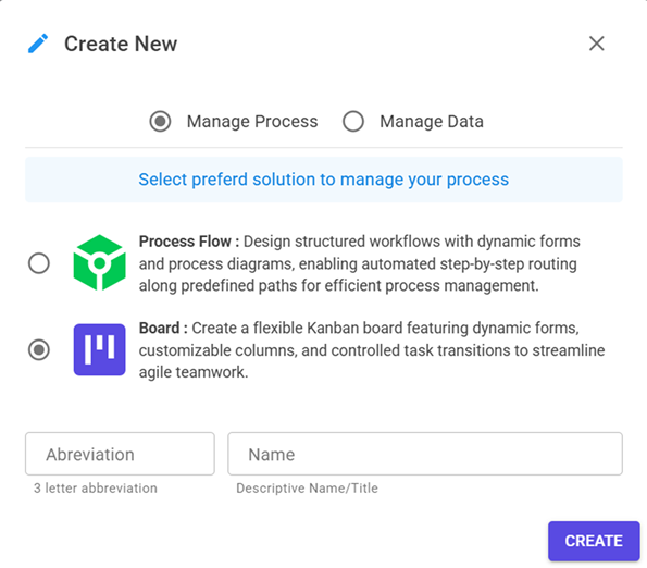
- From the home screen, click Create New. A dialog will appear to choose what to create.
- Select Board from the template options.
- Enter a name and a 3-letter abbreviation (this abbreviation appears on board items for quick identification).
- Click Create to open the Board Designer.
Board Designer
A board template has three main sections that define how work will be captured and visualized:
- Form – design the item input form for capturing data.
- Board – configure columns, transitions, and automation rules.
- Views – control how fields and sections appear within each board column.
Form Designer
The Form Designer in NileDesk allows you to visually design the data entry experience for your processes, boards, and datasets. It is a drag-and-drop environment where you can pick from a wide range of fields, arrange them into logical sections, and customize layouts for both desktop and mobile users.
All available Fields are listed in the side panel and can be dragged onto the form canvas. Whether you need to capture customer information, upload files, take signatures, or record tabular data, NileDesk provides specialized fields to cover different scenarios.
You can always rearrange fields by dragging them, even after placement. This makes it easy to refine the design as your form evolves.
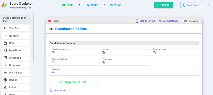
Form Sections
Fields in a form must always be placed inside a Field Section. Sections help organize the form into logical groups so users can focus on related information together. NileDesk also supports Table Sections, which let you add tabular rows of data inside your form — especially useful for “header and detail” scenarios such as invoices, purchase orders, or multi-line approvals.
- Add Section → Choose between Field Section or Table Section.
- Field Sections → Place general input fields (text, dropdowns, attachments, etc.).
- Table Sections → Place structured row-based data like products, items, or transactions.
- Arrange sections logically — for example: Customer details in the top section, followed by line items in a table section.
Mobile Layout
Modern processes are often run on-the-go. To ensure your forms look good on smaller screens, the designer provides a Mobile Layout option at the top. This lets you preview and adjust how your form will appear on mobile devices.
You can adjust each field’s width in mobile view. Simply hover over a field and use the + or - buttons to make it span more or fewer columns.
Tip: Use wider fields for important inputs like names or comments, and narrower widths for quick-select options like Yes/No toggles.
Form Settings
The Form Settings panel gives you global controls over how your form behaves. Some of the key options include:
- Outlined Fields — Toggle field borders on/off for a cleaner or more structured look.
- Adjust Fields — Automatically re-balance remaining fields if some fields are hidden by conditions.
- Process Subject — Define a subject line for your process (e.g., “Invoice #1234 – ACME Ltd”).
Best Practice: Always define a clear Process Subject. This makes tasks and records instantly recognizable in lists, notifications, and reports.
Design Best Practices
- Group related fields into sections for clarity and better user experience.
- Use Table Sections for repeatable rows instead of forcing users to enter multiple fields manually.
- Keep the mobile layout in mind — many users will fill forms on phones or tablets.
- Preview often and test the form in both desktop and mobile views before publishing.
Board Designer
Boards use columns to represent workflow stages. By default, a Draft column is created for all new items. On a live board, users can drag and drop columns to rearrange their order. Once active, each column holds board items, which can be moved from one column to another according to the allowed transition settings.
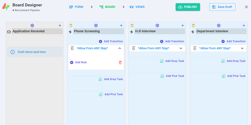
Column Types
Add new columns using the + sign. Columns can be:
- Draft Columns – initial collection points (default: “Draft”).
- In-Progress Columns – e.g., Active, On-Hold, Review.
- Done Columns – closure stages such as Completed, Rejected, Canceled.
Column Settings
Each column has a Settings menu with advanced options:
- Dynamic assignments
- Overdue & deadline rules
- Column-specific authorizations and restrictions
Transitions
Under each column, define Transitions with the Add Transition button. Transitions control how and when items move into a column.
Each transition can include rules such as:
- Validate Field – expression to allow or block the move.
- Users – restrict transition to specific users.
- Roles – restrict transition to specific roles.
Column Tasks
Columns can also trigger automation tasks:
- Add Drop Task – runs when an item is dropped into the column.
- Add Pick Task – runs when an item is picked/moved out.
Available task types include:
- Update Dataset Record
- Initiate New Item
- Trigger Zapier Integration
- Send Email
Views
The Views panel lets you control, step-by-step, how a form behaves and what users see at each baord step/column. Use it to configure field visibility, required/mandatory status, read-only mode, table-row behavior, and to attach conditional logic (via Step Events) that runs on form lifecycle events.
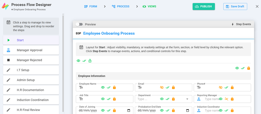
At a glance
- Left column — lists all board column (click a column to edit its view).
- Center/Canvas — shows the form layout for the selected step so you can toggle settings per-field, per-section, or per-table-row.
- Top toolbar — Preview button and the Step Events button for attaching conditional behavior and validations.
Per-item controls
For any field, section, or table you can toggle three basic states for the selected step:
| Control | What it does | When to use |
|---|---|---|
| Visibility (eye icon) | Show or hide the item at this step. | Hide approvals until an action is required, or simplify early steps. |
| Required / Mandatory (double check icon) | Make the field mandatory at this step; user cannot proceed until filled. | Force attachments on final review, or require comments when rejecting. |
| Read-only (lock icon) | Display the field but prevent edits at this step. | Show historical values for auditors, or prevent changes after approval. |
Step Events — control behavior
Just like Process Flow , boards also support step events however it is limited to Load event only to mainly control behaviour of fields conditionally , remaining validations in baords are managed through transition rules in boards more effectivly. Click Step Events to add actions and on lifecycle events of the form for the selected step.
- On Load — Runs when the form opens for this step. Common uses: set default values, show/hide fields based on record data, or prepopulate lookups.
Publishing
- Publish – makes the board available for use.
- Save Draft – save and edit later before publishing.